THE SEQUENCE AND HOW I FOUND IT
Soon after I had started to make drawings of figures found in english cornfields back in autumn 1990 I realized that these so-called pictograms not only looked similar to each other, they also displayed a kind of graphical evolution: Each pictogram contained at least one element that was not there in another pictogram and other elements changed their positions from pictogram to pictogram and this made it easy to put them all into a sequence which at that time was made out of six pictograms. They all had four long rectangles, two on each side of the connecting path between the two main circles, and if you read the sequence from left to right, the four rectangles moved up and induced a ring around the top circle and finally this ring gave birth to a small ringed circle. This sequence was obvious and George Wingfield was the first to mention it in the first CEREALOGIST. In 1991 many possible follow-up pictograms appeared, I linked them to the previous six and in the end the sequence had grown into a row of fifteen pictograms.
What confused me then was that this sequence did not reassemble the chronological order of appearance of the pictograms in the fields and that the row ended with a figure that was nothing but an unfolded element of the long East Kennett pictogram of the 27th of July 1990 (Later I saw that it was also a remake of a nearly unnoticed figure that was found in a field near Bulkworthy, Devon, also in 1990). So I waited for the 1992 season to come to see what new elements would appear. In the end there were many new pictograms, but to my disappointment there was seemingly not one I could use for the sequence. This gave me the idea that maybe all pictograms that were necessary for the logical evolution of the row already existed and that there was another connecting element between the figures which I might not have noticed yet. I looked at the chronological sequence of appearance again and saw that there was a certain logic behind it: After the chronological direction had changed twice between the first four pictograms of the row, it stayed the same for three figures, then moved backwards for two figures and then into the future again for one pictogram. After this the pattern repeated itself, only the other way around: The twelfth figure had appeared before its neighbour on the left, the next two had come one after another (from left to right) and the last figure again had been found before its left neighbour. It looked as if the right half of the row could be a mirror image of the left side seen in a chronological way. Once I understood it like that, it was not very difficult anymore to find the missing figures, I only had to arrange them according to the hopefully complete sequence on the left. So I added the long pictograms of 1990 and also others from the same year. Finally the dates of appearance seen from left to right looked somehow like a large loop through time with its beginning in May 1990 and going up to 1991 and returning to 1990, where the line crosses itself on the 12th/13th of July (Crawley Down 13th July 1990/Alton Barnes 12th July 1990) before it becomes linear in time again. I also added other figures which are not in the row, but form an own line that is connected to the main line. I found these figures by checking out where some of the three-fingered claws of the long pictograms pointed and it seemed like they were pointing at other figures which were incorporated in the following figures in the sequence. For example, the large claw of the Milk Hill figure dating from the 12th of July 1990 pointed at a single circle with a small three-fingered claw that appeared a few days later. In the next pictogram a circle with a claw is part of the whole figure, and also the preceding pictogram had a circle with a claw not too far from it. And as with all similar looking figures, these similar looking circles with claws add up to three. Another short sequence of three figures is connected to the East Kennett pictogram of the 27th of July 1990 and peculiarly the three-fingered claw of this figure pointed exactly to the corner of a field a few hundred meters to the west where the dumbbell with a hook and a so-called signature appeared on the 27th of July 1991.
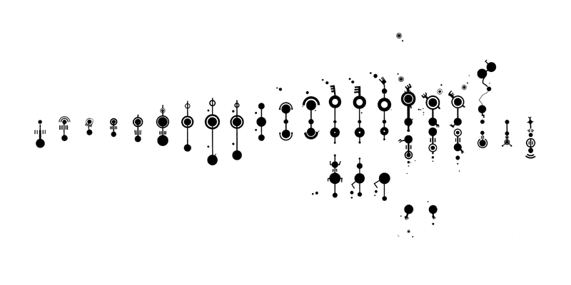
fig. 1
The last figure I added to the sequence is a figure from 1992 which also - like some of the large claw-and-key pictograms - aligned with Silbury Hill's eastern edge. The sequence contains 27 or three to the power of three different formations. Nearly all of them are standing "upright" on this sheet of paper, that means their top was close to the nearest field border. If you look at fig. 1, you see the sequence of crop formations displayed from left to right with similarity as its first principle of order and the lines drawn between the figures make clear which circle conforms with which in the next formation. The second principle is that of chronological order. Small arrows between the figures indicate whether a formation came after (arrow points to the right) or before (arrow points to the left) its neighbour on the left side. This might be a bit confusing, because in this special case time is not shown as a straight line from past to future, but as a space in which an action is able to change its direction.
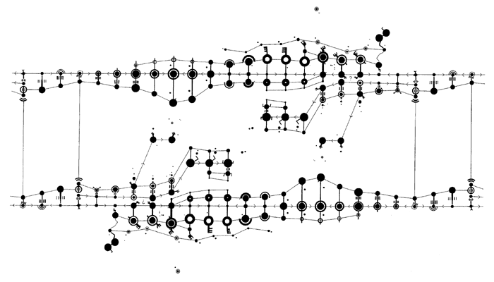
fig. 2
I then connected the two pictograms that appeared in the same wheatfield on the Hazeley Down near Winchester on the second of June and the third of August 1990. The easiest way to do so was to double the entire row of pictograms so I got a reversed row below the original row and the whole picture showed something like a closed circuit (fig. 2). The reason for the linking of these figures was the fact that also the original crop formations were connected by a tramline that ran through the ring of the first figure and then along the axis of the larger second pictogram (fig. 3). But to make it complete, I repeated this closed circuit and connected it to its loose ends on each side to form a virtually endless row (fig. 4). I took the legitimation for this large link-up from the dimensions of the two formations connected: They are nearly the same. The large circle of the Chilcomb pictogram had a diameter of 16.10 meters, while the ring of the Hazeley Down formation was 16.70 meters in diameter. The small circle of the Chilcomb formation was 7.20 meters across and the circle with two spurs and an Y-shape attached to it measured seven meters. Also the width of the four rectangles (1.20 meters) related to the width of the four small curves (between 1.20 and 1.30 meters). Fig. 5 shows how well these two figures suit each other when their largest circles are drawn in the same size. (All dimensions are taken from published surveys drawn by Stanley Morcom and Peter Baillie)
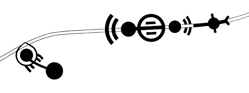
fig. 3
After all my drawing, measuring and searching I got an interesting graphical structure as the result. It was good to look at, so I hung it on my wall and because it seemed to stare back at me like a multi-eyed flying creature, I nicknamed it "Dragon". It does not talk to me though, but among the many associations I had with it, there are two that I like more than the others. The first interpretation of the dragon sees it as a piece of music written down in a strange and yet to be decoded notation. But since Gerald Hawkins has found out that the graded diameters of crop circles fit into the diatonic scale of musical harmony, it can�t be too difficult to make the dragon sound. There is also a method of deriving musical intervals from the underlying pentagonal, hexagonal and octagonal geometry which was originally invented by Johannes Kepler as a way to make music out of horoscopes. This method was refined by Hans Cousto and it simply uses the angles of the aspects to find a geometrical figure that indicates intervals in a doubled octave which is projected on a full circle.
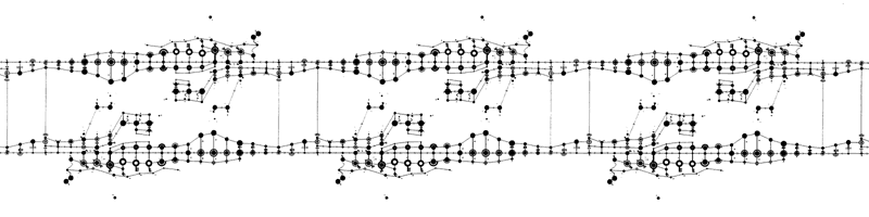
fig. 4
The other interpretation looks at the sequence as a graphical description of the transformation of a molecular structure: It it possible to see a circle as an atom and the rings, paths and claws might represent its hulls, electron orbits, valencies and bonds. If the row of crop formations shows a molecular structure going through different stages of transformation, the main point of it seems to be the melting together of two circles/atoms into one by creating a chronological imbalance around them. It is difficult to describe this in words and I think if the sequence is seen in this way, figs. 1, 2 and 4 speak for themselves. (Do they?) I named this interpretation the "chronologically induced nuclear fusion" and though I invented this catchy phrase for the fun of inventing a catchy phrase, it later appeared to me that there really might be a possibility of melting two atomic nuclei into one by shifting one nucleus from its place in linear spacetime back or forward in time to another place which is already occupied by another nucleus. The two nuclei would then have to integrate themselves into each other with all the known consequences in linear spacetime. The required "distance in time" would not have to be very long, the nucleus would have to tunnel through only a tiny fraction of a second. Probably this happens naturally from time to time as the result of the so-called tunnel effect known in quantumphysics, which nowadays is only accepted as an effect in space, but I can see no reasons why this effect should not take place in time. The problem is that there are no known methods of observing, initiating and controlling tunnel effects like these.
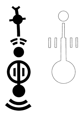
fig. 5
I really do not know if the sequence I found stands for one or both of the two events mentioned above or if it means anything at all. But if it should describe something like a chronologically induced nuclear fusion and it certainly would if somebody who is inspired by this sequence (or by anything else) discovers something to which the name C.I.N.F. could be attached, I only want to say that it might be a very powerful source of energy probably not easy to handle and that whoever might find it is responsible for the consequences. Better steer clear of the temptations of capitalism and use the sequence as an inspiration for a piece of music. (Sorry for being patronizing!)
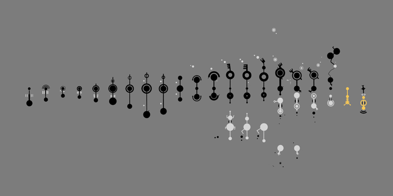
fig. 6
Finally I think it is best to explain why I seem to be so obsessed with this sequence. In early November 1991 I extended the sequence from its original six formations to then thirteen. I left all the small photocopied figures lying on my desk overnight and I woke up in the middle of the night to an invisible source of a whistling, squeaking sound hovering above my heavy wooden table which made creaking noises as if it was pressed by a heavy load. I was amused while this was happening but I was scared the next morning and for the following six months. Still I don't have a suitable explanation for this but whatever it was, it made me cling to that sequence and consider it to be more important than before. I don't know if it is alright to mention all this in public, but since the fairies seem to have left me anyway, they probably won't mind it and I promise not to write anything more about it than this.
Post Scriptum
This is so far what I wrote nearly two years ago for "The Circular", where it got published in issue No. 20 (spring 1995). Since then I haven't thought much about the sequence, but recently I started working on the scale of all my drawings and also the sequence had to undergo slight changes. Now all the crop circle formations are shown in the same scale (which is approx. 1:4420 in fig. 1) and I thought this to be a good occasion to give this sequence a new chance of public discussion. I have found no new clues concerning a probable meaning of this row of crop formations and I still think it might mean anything or nothing at all. In case it means something, it still might be not complete. There were more pictograms imprinted in english cornfields between 1990 and 1992 and also at least two pictograms pointed at Silbury Hill, while others aligned with other prehistoric monuments or the Alton Priors Church (unfortunately I do not know much about these alignments). All this might be taken into a possible interpretation. But the approach of a visual display is highly subjective and where one finds associations and similarities, another one sees only a mess of disconnected things. So the sequence might be an abstraction of a nuclear process or a line of musical notes, but it also might be the secret name of a forgotten place or a personal message to you. It all depends on your perception in the moment you open the box to check whether the cat is still alive or not.
© 1995 wolfgang schindler
Kommentar
|